BlackRock / iShares
UX writing + copywriting + design system + style guide
Writing a design system to help iShares deliver consistent and inclusive digital experiences — and make investing accessible to everyone.
I joined the Ustwo X iShares team as the sole UX writer to develop the design system from a content and linguistic perspective.
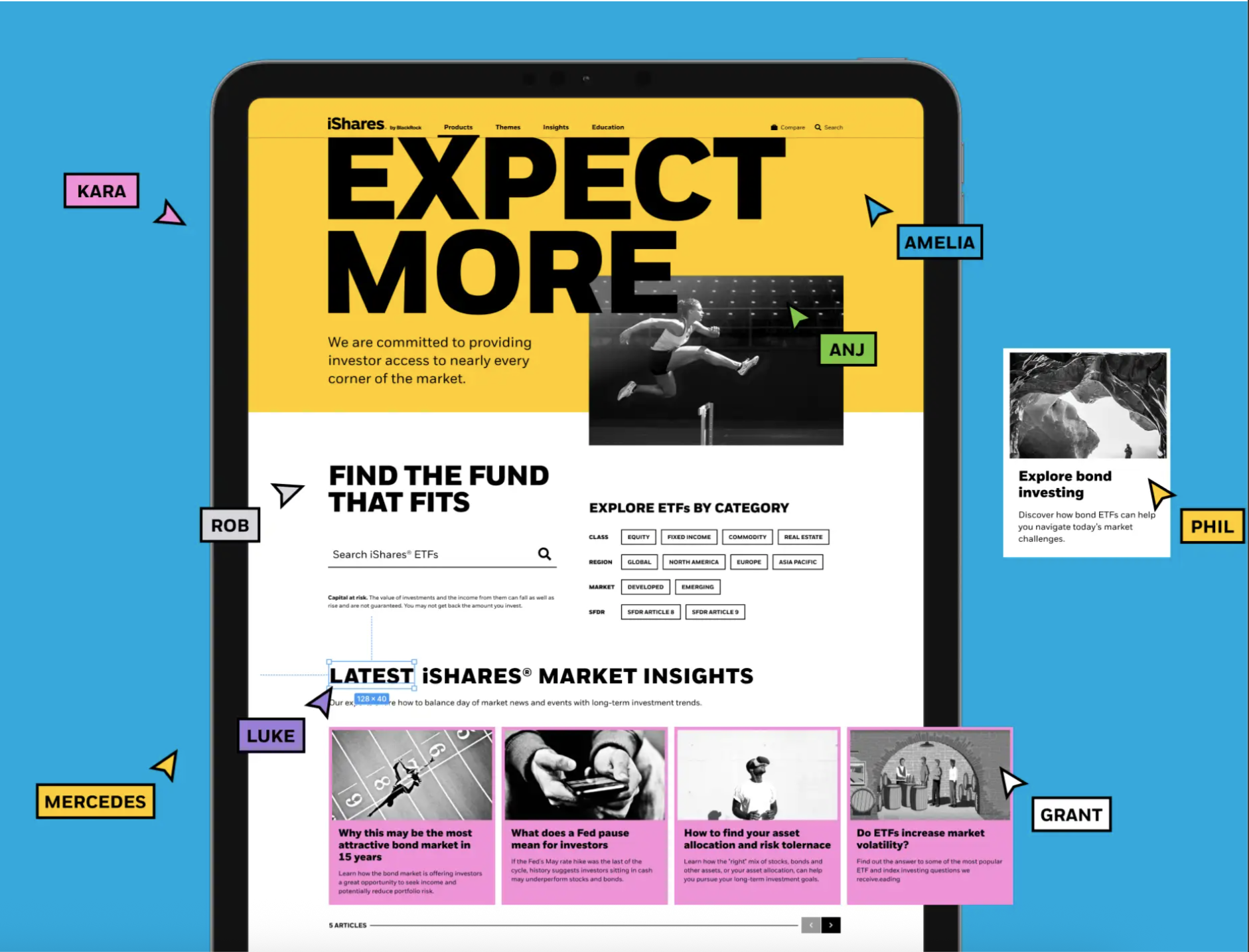
If you’re not familiar, a design system is a comprehensive library of design elements, components, patterns, page templates, and best practice guidelines.
Working closely with the iShares team to know exactly what they — and the 120 million investors — needed from the product, we created a flexible toolkit of reusable components (such as buttons and banners), the guidelines for how to use them, and the design principles and standards that underpinned the design system.
The work
Project goals:
Audit the current iShares website to inform the content strategy of the design system.
Develop guidelines for each foundation and component, including usage, design, content and copy.
Create the copy style guide of the design system, starting with a tone of voice (helpful, human, and trustworthy).
Provide the UX copy for components, such as forms, error messages, and tooltips.
Ensure the content is accessible and inclusive.
Design and deliver all content in Sketch and Figma.
Some results
15% increase in the accessibility rating of the iShares website
50% speed efficiency improvement in design workflows with the design kit
4/5 InVision design maturity score for iShares